
MAKE IT EASY
Digital menu designed to improve the service experience in restaurants.
Introduction
Make it Easy is a digital menu app for tablets designed to improve the service experience in restaurants and manage products in an easy and customizable way.
Challenge
Create a digital menu to be used by restaurant consumers, providing a new and modern way of ordering food.
Provide all the information and tools necessary for the customer to place an order quickly and simply without needing help from the restaurant staff.
Develop a tablet app with a minimalist, reliable, and visually appealing interface.
Use a white label solution, allowing restaurants to integrate their branding, customize functionality and adjust settings to the needs of their customers and business.
My contribution
In 2019 they contacted me to create the app design from scratch. As the only designer on the team, I worked with developers and the product manager to build the app. I was responsible for collaborating with the defining, ideation, prototyping, testing, and delivering for the developers.
COMPANY
Make it Easy
PROJECT
Digital Menu
Tablet App
Android
MY ROLE
UX/UI Designer
TEAM
1 - UX/UI Designer
1 - Product Manager
1 - Front-end developer
1 - Back-end developer
TOOLS
Figma
Miro
Notion
Whimsical
YEAR
2019


Competitors Analysis
Was analyzed the behavior of our direct and indirect competitors in the market to gain insights into the specific features and experiences they offer. By doing so, we can identify areas where we can differentiate ourselves and better meet the needs and expectations of our customers.

”I do not like digital menus via QR Code that I have to access on my cell phone. They are confusing and depend on the stability of my internet connection at the location.”

”I find it a bit of work to know what each person ordered when we are about to pay the bill.”

”To be in control of what I am consuming, I write down all my orders on my cell phone to check when we ask for the bill.”

”I like to see large photos and descriptions of the food on the menu.”

“I go to restaurants daily during my lunch break at work, so I don't like to waste time ordering.”

"I always look for deals on restaurants to save money."
The interviews were focused on understanding the people's routines in restaurants, the idea was to gather insights into their experiences and needs.
User Interviews
5 PEOPLE INTERVIEWED
Based on patterns in user behavior and common traits from the User Interview, 2 personas were created to help focus upcoming design efforts.
Personas
Kristin Watson
WITH FRIENDS OR FAMILY
Likes to go to restaurants with friends or family and stays there for a long time.
Pain Points
-
"Usually we have difficulty knowing what each person has consumed".
-
"We have to check and do the math when it's time to divide and pay the bill".

Jacob Jones
WORK ROUTINE
Usually goes alone or with some friends on his work lunch break.
Pain Points
-
“I'd like to choose my order quickly, and I don't waste my lunch break time”.
-
“Since I frequently have to spend money at restaurants, I would like to easily see promotions to save money".

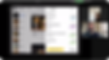
We used the Sitemap to have an overview of the entire app, allowing us to understand the complexity and depth of the project.
Sitemap

The Matrix 2x2 helped us determine the essential features to prioritize for our first MVP, enabling us to focus our efforts more effectively.
Prioritizing
2x2 Matrix

-
Possibility to call the waiter.
-
Rate the experience of the app, restaurant, and food.
-
White label.
-
Be used on the table or counter.
-
Highlights and promotions.
-
Page of news and advertisements.
-
Notification to pick up the order at the counter.
-
Identify who ordered each item.
-
Bill splitting.
Features selected for the MVP.
Set of standards delivered to developers that facilitate the creation of the product, minimizing the error of inconsistency on the page that will be developed.
The company's brand colors were used as the app's default colors, but as it is a white-label product, restaurants could change the primary and secondary colors to the colors of their brands.
Styleguide
Components


Through this test, it would be possible to understand if the designed page and all the information were clear to the user. In addition, to observe and listen to how users interact with our product so that improvements can be proposed to perform these tasks.
To conduct the usability test, I created a clickable high-fidelity prototype using Figma.
Usability Testing
REMOTE WITH 5 PEOPLE

Each user was assigned two tasks, carefully selected to analyze the most critical features of the application.
Find a specific item on the app and place the order selecting who is placing the order.
Task 1
-
Observe if the flow and components are clear and intuitive.
-
Check if the user flow of adding and indicating who is making the request is understandable.
Goals

Expected flow in task 1
Ask for the bill, select the person who wants to pay the partial bill, and do some evaluations at the end.
Task 2
-
Observe if the flow and components are recognizable and intuitive.
-
Test if the selection of who wants to pay is clear.
Goals

Expected flow in task 2
Changes on the menu items detail and how to select who is ordering.
Improvement 1
Before

After
Spliced into two parts


Changes on placed orders and select the user who ordered.
Improvement 2
Before

After

Changes on the payment page.
Improvement 3
Before

After

Changes on the experience rating page.
Improvement 4
Before

After

Improvements
By conducting the test, we got valuable insights into user behavior and preferences, which guided us to refine and enhance the user experience.
I created a wireframe to define the content placement and structure for each page, allowing the team to have an overview of how the final design would look.
Wireframe

Design and features

While the tablet is on standby it will show some information and advertisements selected by the restaurant.
Waiting screen
Home and Products list
This is the first screen that the client sees, here they are introduced to the app for the first time, so we created a clear layout with the essential pieces of information that they could need.


Item details
Here user can see details of the selected item, item options, and extras.
Who is ordering
Function designed to identify who placed each order and help when they want to split and pay the total or partial bill.


Allowing color customization of different brands' specifications and the possibility of toggling functions as the restaurants need. At the same time, make sure to have consistency, high usability, and compliance with minimum standards for Google Play Store approval.
White label system

Notifications
Automatic notifications showing that the order is ready for pickup at the counter or any other message sent manually by the restaurant.
More projects

Helping local small and medium-sized commercial establishments to deliver their products.
GOWDOCK

In retrospect
Working with Make It Easy on this project has been a great opportunity to apply a lot of the theoretical knowledge I had as a Product Designer. I have been able to lead the end-to-end design of an entire platform in a very high-paced environment, always in collaboration with Product Managers, Back-end and Front-end Engineers.